The joy in printing an image
It’s unfortunate that printing an image has such a bad reputation online. If you Google “how to print a photo”, you’ll get about 100 links on how to print from your phone, and then 1,000,000 links that talk about the perils and pitfalls of printing an image. At some point in your treacherous journey on Google, you’ll come across the dreaded topic of “colour management” and things will quickly devolve into “spiders” to measure your screen, and the ever present and somewhat ridiculous statement that printing is too expensive, so don’t bother.
While I can’t discredit those statements, because they’re largely true, I will provide an alternative and simplified approach to printing that has worked very well for me. Much like the post I wrote regarding Capture One image workflow, which has garnered tremendous positive feedback and remains the #1 saved post on the DPReview Fujifilm forum for over two years, this post will focus on keeping things simple while still getting a good end result.
Why should you print your image?
When an image is viewed on a mobile phone, tablet or mobile computer, there is a certain impact to that image. When you take the same image and view it on a 5k screen, the impact increases exponentially. Take that same experience and imagine the impact increasing exponentially again, but this time from the 5k screen to a printed medium. I don’t know exactly what causes it, but being able to hold, feel and see an image in print generates an incredible experience.
I wanted to test if this feeling is tied to an emotional connection with the analogue format of film from my youth; to test the theory, I brought out a Fujifilm Instax printer to some family events with my younger niece and nephew. I took images of the family gathering and then printed them using the Instax printer. The resolution and image quality on this printer is fair, but nothing special, however what was special was the reaction from the recipients. I’m confident that each of them still has the print in their wallets and purses to this day.
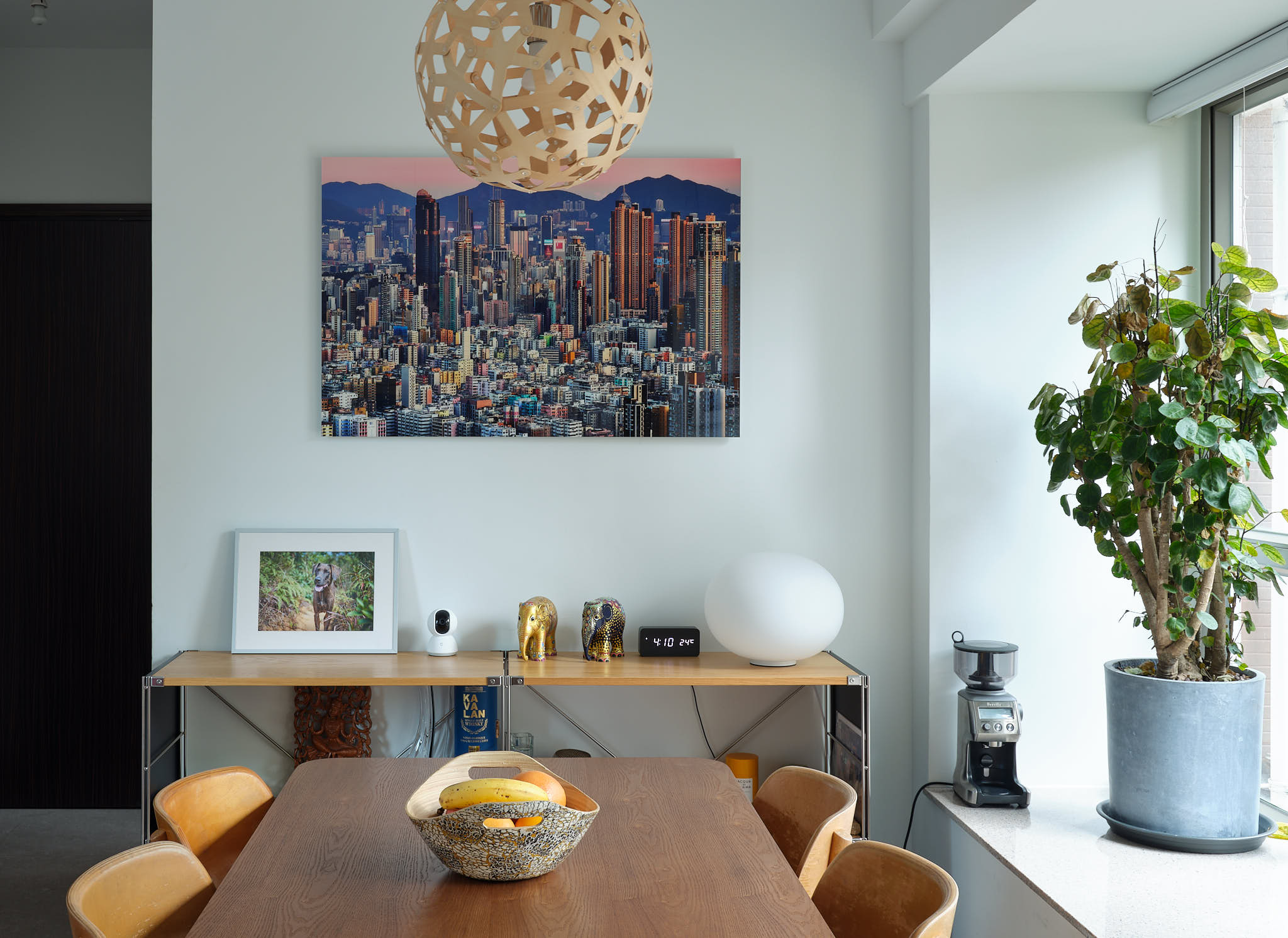
An Instax print is tiny so imagine the emotional impact that a larger print has on a person, especially if that person took that image herself. When I go to the (amazing) local Canon shop here in Hong Kong, I’m always saddened to hear that not many people get their images printed. We’re in a world where 24MP can be found in a basic camera, but yet so few people print images from those cameras. The Canon shop staff love seeing the reaction when their clients see their image, that they worked hard to take, get printed on 13”x19” paper or larger.
My goal with this post is to encourage you to print at least one of your images in the hopes that you get to enjoy the same satisfaction that I and so many others have found from the printed our images.
Is printing an image difficult?
To get a perfect print, with perfect colour, brightness, and consistency, requires a lot of knowledge and preparation. In this post, we’re going to be willing to sacrifice a bit of perfection for efficiency and simplicity. Those tradeoffs, depending on the type of computer you have, may actually be quite minimal. For example, if you’re an Apple Computer user, the tradeoffs will be minimal because your LCD panel on the computer is already pretty accurate, and the printing pipeline is relatively simple. However, if you’re a Windows user, given the multitude of potential setups, it’s difficult to predict how big the tradeoff will be.
There are three areas that trip people up when it comes to printing images:
- Prints coming out too dark
- Colours coming out inaccurate or flat
- Prints coming out less sharp or blurry
We will try to address all three of these in the simplified process below.
A simplified process for printing
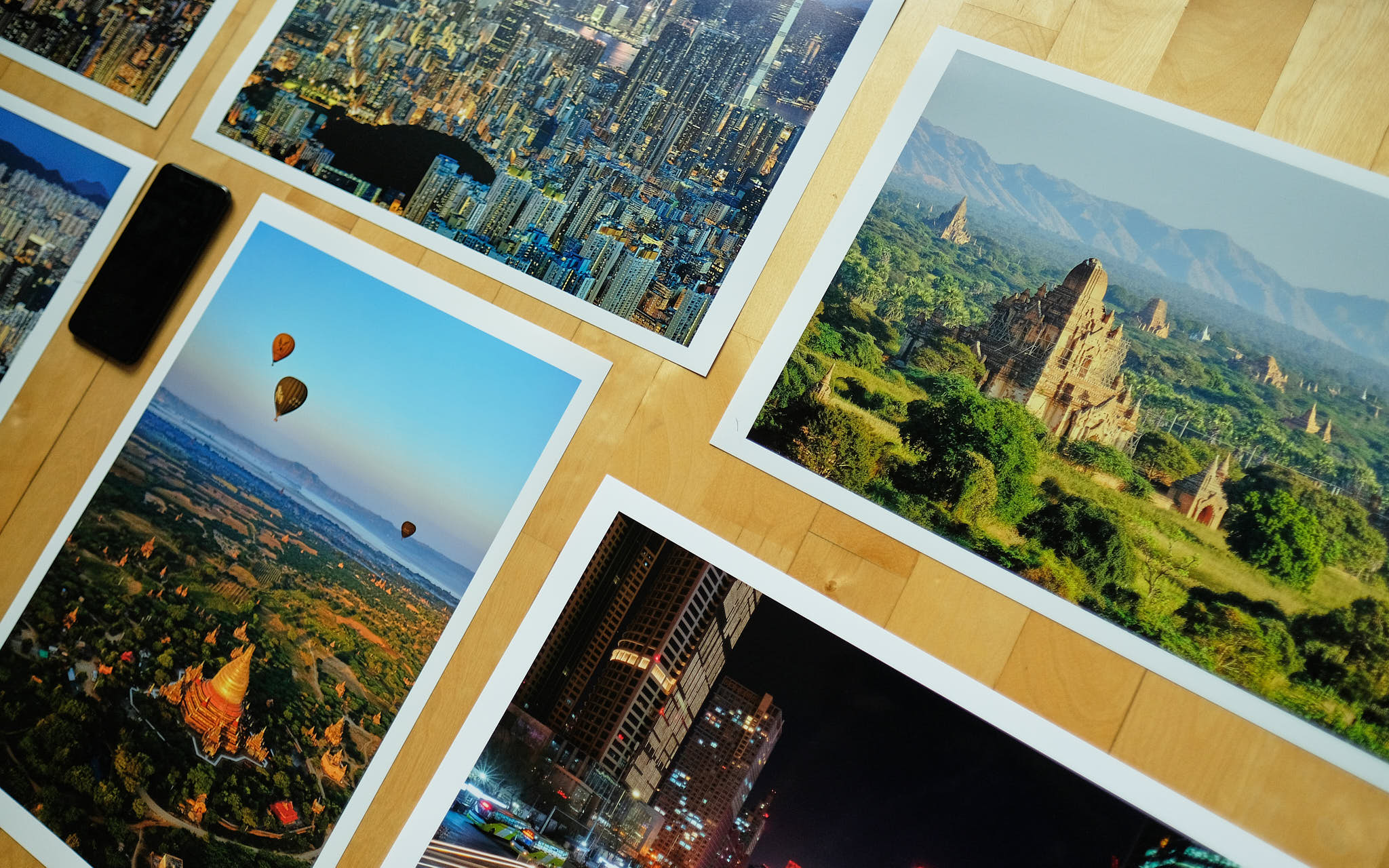
1. Choose your image carefully
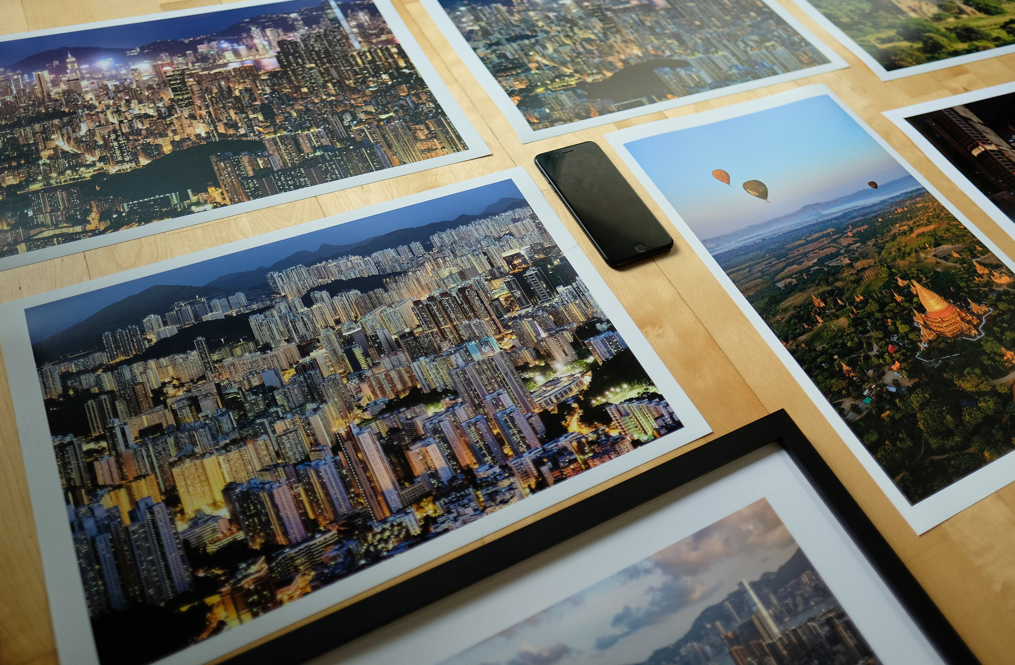
Printing, depending not the paper size, can be rather expensive. It’s about US$14 for a 13”x19” A3+ colour print on lustre Canon paper here in Hong Kong. If you’re using the final print as your proof, this cost can add up really quick. The first few times I printed, I went through ~3 prints per image and ended up with a pretty hefty bill. I ultimately only ended up framing a handful of them so the others remain in an envelope somewhere.
You should therefore put some effort into making sure the image you’re thinking of printing is worthy of being hung on a wall. Ask yourself if you can see this image hanging on your wall in a year’s time. How do the colours match with the environment you want to showcase it? How will you mount it on the wall? Will you print on paper and frame it, print under acrylic, on metal, canvas or the myriad other options available. The output format plays a role in the images that work best for that format. For example, bold colours with geometric shapes work extremely well with a metal print, but don’t work as well with a canvas print.
2. Check the resolution is sufficient for the size you want to print
With modern cameras, you can print exceedingly large images so this is less of an issue. However, if you’ve cropped your image heavily or if you want “Retina” level of sharpness in your images when viewed at nose distance, then the source resolution does matter. The amount of resolution you need is dependant on how large of a print you intend on making, given that larger prints are viewed at further distances in order to take in the entire print. Therefore, the larger your image, the less resolution you need, which I appreciate is rather unintuitive [xxx include an online guide on distance to print resolution]
For my prints, I like to go right up to the wall and take in all the luscious resolution on display, so I set my minimum resolution at 200 PPI. To calculate PPI, just divide the resolution of your image after cropping by the size of the image you want to print. For example, if you’re using a 24MP camera with 6000×4000 pixel resolution, if you want to print at a 13” x 19” A3+ size, you have 6000 pixels / 19” = 316 PPI or Pixels Per Inch horizontally and 4000 pixels / 13” = 308 PPI vertically. Since both are higher than 200 PPI, you can easily make this print with more than sufficient resolution.
My GFX50R produces files of 8,256px x 6,192px, which to my personal standards, I’m willing to print as large as 41” x 31” (8,256px / 200 PPI = 41.28” x 6,192px / 200 PPI = 30.96”) without having to do much work to the image for it to look amazing. With modern technology from software like PhotoZoom, Topaz Gigapixel AI, Affinity Photo, and many others, the ability to increase the resolution while keeping the details from breaking up means you can actually print far, far larger than those dimensions with incredible resolution; that whole process of increasing the resolution beyond what the camera produces is a topic too technical for today’s post.
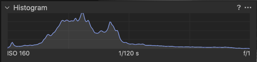
3. Check the histogram for brightness
This is perhaps the most important step in the process. The screens we use to edit our images are far too bright and often in rooms that are also too bright. I’m sure you’ve experienced this before; you’ve just finished editing a series of images and exported them to JPEG and put them up on social media.
Checking on how the images are doing the next day, you note that they look a lot darker on your phone than they did on your PC. This is a direct result of using the brightness of your screen to make a subjective judgement on brightness, rather than using an objective measure such as the histogram within your post processing software. There is also the consideration that our editing screens emit light whereas a print reflects light; this has an impact especially on contrast and colour saturation.
Before I get into the approaches I take to overcome this, I want to make it clear that you have creative control of your image. If you want the print to be dark because you’re going to be putting a light on the print, then you should take the appropriate measures to make that work. If you want to have a dreamy high-key portrait with the highlights completely blown out, then you should ensure that your histogram shows that. The below guidance is for a generic image, which you can then tweak to achieve your creative vision.
For images that were taken in daylight, it’s fairly easy to adjust the brightness. It’s when you get to the extremes of a dark image such as a night scene, or a bright image of a high-key portrait for example, where it gets a bit more challenging. There are several ways to overcome these challenges, but the below will give you a good starting point.
Daylight images:
Level of difficulty: Easy
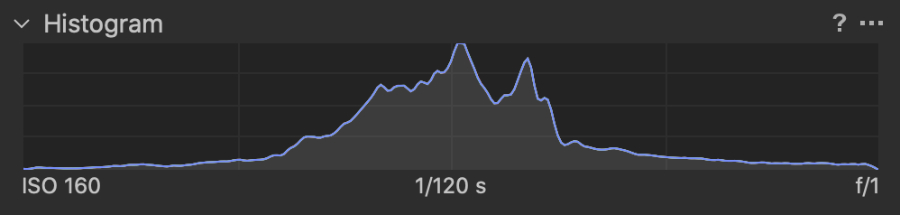
Make sure the histogram has the majority of the density in the middle. Ensure that the ends of the histogram touch the ends on both sides (with minimal clipping or going beyond the ends). If you’ll be placing the print in a dark location with no lighting, consider further brightening the image by 0.1-0.3 stops. One good solution when increasing the exposure of an image that is already clipping highlights is to use a curve which you grab in the middle and pull it up; this increases the mid-tones without affecting the shadows and highlights.
Night or dark indoor images:
Level of difficulty: Hard
Night images are the most challenging to work with. On one hand, you want to keep the nice dark tones to show that this was a sunset or night image, but on the other hand, if the print doesn’t have a light focused on it, the overall print will lack impact. To further complicate matters, night images often have bright city lights which need to be carefully managed if brightening the image for print.
For these types of night images, I suggest adjusting the image such that the majority of the histogram is in the bottom third, and then adjust the blacks and whites so that the histogram touches both ends for good contrast. From there, you can then bring the mid-tones up until the subject has good brightness, while not effecting the highlights too much and not turning all the nice blacks to grey.
Portraits:
Level of difficulty: Easy
I suggest cropping the image to the subject’s face, adjust the brightness until the histogram is centred just like with the daylight histogram above, and then remove the crop. If you have a dark location for the print, consider adding 0.1-0.3 stops of exposure to give the image more impact. You can then adjust the black and white points accordingly to ensure you have the creative contrast you want. A high-key portrait as example may not need a black point because you may want that bright dreamy look.
Run a test print:
If you’re printing an expensive large print, or if you’re just unsure how it will turn out, a simple way to resolve this is to run a small test print either at home or at the lab. Even a black & white laser printer is sufficient to test out whether the image will print with the desired brightness.
4. Check the histogram for “out of range” colours
Now that you have the brightness of the image sorted out, it’s important to do a final check on any colours that are out of range. You may have chosen to have some colours out of range intentionally, but what I often find is that, in the rush to get the brightness sorted out, I sometimes miss that I’ve made an adjustment that has now severely clipped a colour. Where this often shows an issue is in sunset images; by brightening the image, the reds may become clipped and change the tone of the sunset colours. All post processing software has some mechanism to see clipped colours, so I suggest using that to identify any problem spots. I should also warn you that trying to bring back clipped highlights too far can often result in haloes around objects so please be on the lookout for that.
5. Adjust the output parameters for print size, resolution, sharpness, colour space, and file format
With the image being carefully chosen, resolution checked, brightness checked, and colours checked, the final step is perhaps the most important alongside checking the brightness, in order to get a great print. Regardless of where you’re going to get the image printed, I suggest you follow this process and ignore any “automated colour correction” that your print lab may provide. If you’ve followed the above correctly, there will be no need for automated colour correction or contrast correction.
The key points for exporting the image:
Image Size: I always recommend setting the image at the output size rather than leaving it up to the printer or the print lab to extrapolate the data. For example, if you’re making a common A3+ print from your 24MP camera, you would set the raw processor software to export the image at 19” x 13” at the resolution that you desire.
Resolution: It’s pretty safe to set the resolution at 300 PPI; if you have resolution to spare, you can include it in the file, but I have not seen any benefit to the naked eye beyond 300 or 360 PPI. For most printers and print labs, having the image at 300 PPI means that the printer won’t have to do any further extrapolation of the data. As an aside, some printers such as Epson prefer the image be saved in 360 PPI, so it’s always advisable to check with your printer manual or the print lab for the optimal PPI.
Sharpness: Prints look less sharp than screens do, so I recommend adding some output sharpening, at the output print size, in the export schema that your post processing software provides. To get into the ballpark of how much output sharpening you need, the image should look a bit crunchy and over-sharpened on the screen, and then back it down from there a bit. I err on the side of under-sharp rather than over-sharp; a less sharp print looks organic, whereas an over-sharpened print looks digital.
Colour Space: This will be controversial but I recommend that you choose sRGB rather than AdobeRGB. There are very few situations where AdobeRBG has made a difference and it’s so minor that it’s not worth the potential problem if the print lab is using sRGB and has to interpret the colours to fit the smaller colour space. Most print labs that I’ve used prefer sRGB, although many now take AdobeRGB as well. I’ve had far more problems with colour mismatches when sending AdobeRGB files than sRGB so I now use sRGB exclusively with print labs.
File Format: You really have two choices for file format, either 8-bit JPEG or 16-bit TIFF. It’s again best to ask the print lab what file format they prefer, but I would again suggest going the easy route and saving it to an 8-bit JPEG file with 0% compression. This makes the file easier to send digitally (smaller), and the 8-bit colour space will show you any potential issues with gradient banding before it goes to print, where it may appear even if a 16-bit TIFF is used. The only situation where I recommend a TIFF file is if you’re printing an image with intense gradients like a sunset; in those situations, the extra data can be visible to the naked eye.
Colour Space and File Format: To some extent, these two go hand in hand. If you choose to use an 8-bit JPEG, it’s normal to also use the sRGB colour space. If you choose 16-bit TIFF, it’s also normal to use the AdobeRGB colour space. However, some labs now allow more flexibility to mix and match, but the combinations provided here are the safest, JPEG + sRGB, or TIFF + AdobeRGB.
Conclusion
One of the greatest joys of life is to see one of your images printed in a large format, hanging in a prominent place where you can see it every day. It’s too bad that printing has gone somewhat out of style with today’s mobile device craze. I hope the above post has encouraged and inspired you to give printing a try. I know that once you try it, and hold that print in your hand, you’ll be hooked. Heck, after the first few prints, I decided to pick up a Canon Pro-100 printer and have been printing non-stop ever since. The most recent print I need involved an excellent lab here in Hong Kong that made me a 40”x30” print face mounted under 3” acrylic, which is then attached to aluminum dibond. It turned out amazing and will soon be hanging in my office in Beijing.
If you give printing a try, please let me know in the comments below if the above content helped; you don’t need to sign in to post a comment. If you have additional advice or if you see something confusing about the content above, please let me know and I’ll consider making edits to make it easier to understand. My goal is to get as many people printing their images as possible.
Discover more from fcracer - Travel & Photography
Subscribe to get the latest posts sent to your email.